This isn’t a blog post on ‘how to use PowerPoint’. I’m no PowerPoint expert, and anyway I’m often too lazy to put together properly thought-through PowerPoint presentations for conferences. But I’ve been pondering about the different uses of PowerPoint I’ve witnessed and/or tried, so here are some brief thoughts on their strengths and weaknesses.
1) No PowerPoint
If you’re not over a hundred years old, then not using PowerPoint means either you think you’re God, or you actually are. I’ve listened to exceptional presentations not using PowerPoint. I’ve also listened to atrocious ones. I think it attracts both ends of the spectrum: outstanding people and terrible ones; the brightest and the laziest; the most captivating and the dullest.
Weaknesses:
The correct reaction to a presenter saying, ‘I don’t have a PowerPoint for you today…’
- Not having a PowerPoint immediately gets you some negative karma from 90% of the audience.
- Such presentations can be a pretext for reading an article tailored for publication rather than a paper tailored for a conference, which is a terrible idea.
Strengths:
- If you do it well, it’s extremely impressive.
- If you do it well, we’ll all remember your ideas.
People whose non-PowerPointed presentations I like are those who go the extra mile to structure and signpost their talk very carefully, compensating for the lack of visual anchoring. People whose non-PowerPointed presentations I hate are those who take it as a pretext for endless digression. You must be über-rigorous and have some seriously good ideas if you want to convince the audience that they wouldn’t have benefited from any slideshow. (You must also be prepared to see some people closing their eyes or doodling – which probably means they’re much more focused than if you were flashing lots of pretty pictures.)
2) The (almost-)all-pictures PowerPoint
Some people use PowerPoint as visual stimulus, but don’t want to distract from the verbal content of their talk by providing words or sentences on the screen. Their PowerPoint shows a book cover while they discuss the book, or a painting of a reading child while they discuss children’s literature.
While not necessary in any way, those decorative PowerPoints provide staring material.
Weaknesses:
- Like number 1, they can be a pretext for people to read off an article to which they’ve added some pictures, rather than a proper conference paper.
Strengths:
- With a bit of imagination, it can become extremely interesting.
Yes: it’s wonderful when this type of presentation – with a little help from picturebook theory! – offers the opportunity to have interesting gaps between the verbal and the visual – between the text you read and the pictures you show. This can create surprise and laughter, and tremendously increase audience interest.
A good example is Scott McCloud’s Ted Talk on comics – obviously, as a comic artist and theorist himself, McCloud knows better than anyone how to take advantage of the gap between words and pictures.
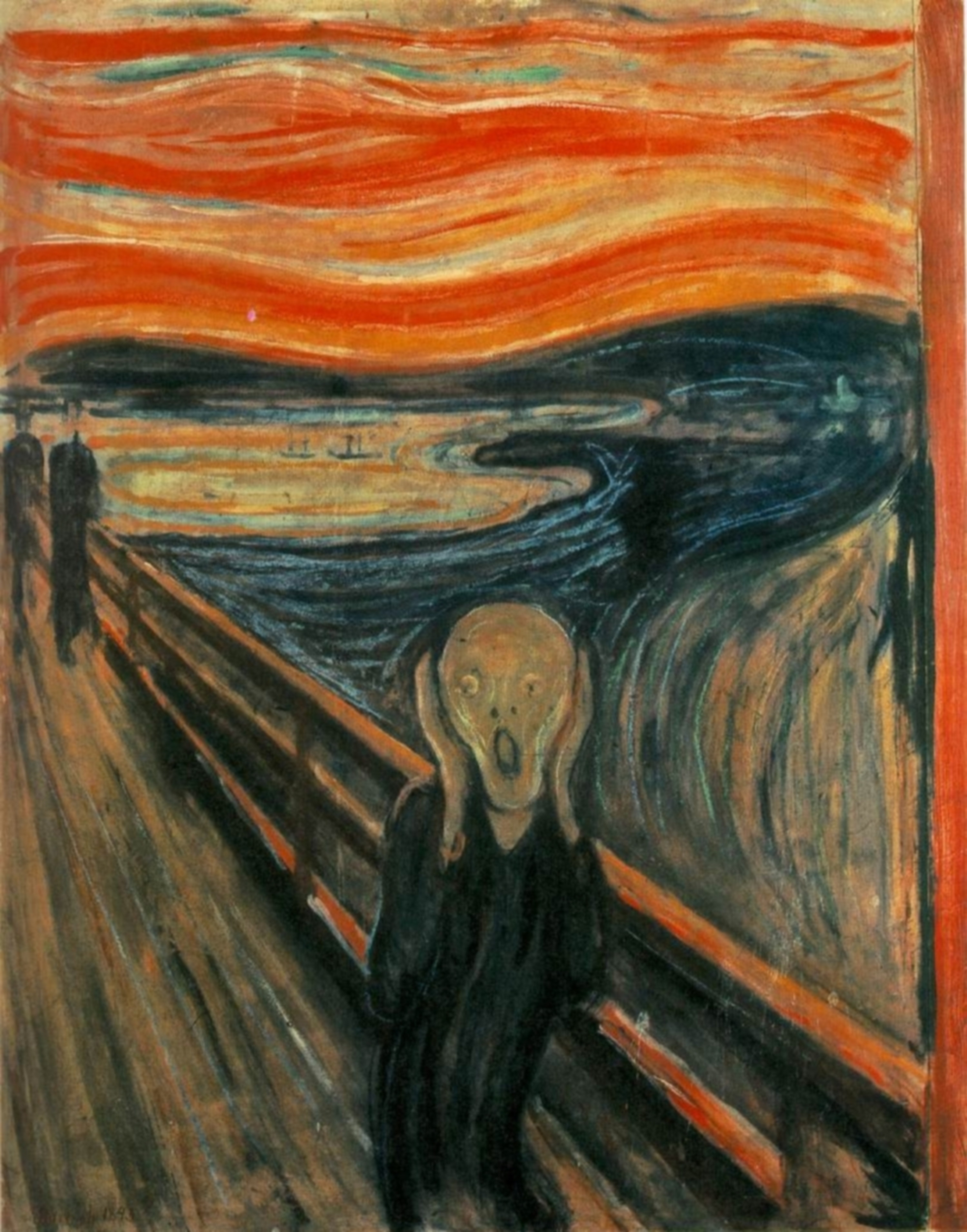
The trick to get a laugh is to avoid mentioning the picture. Pretend it doesn’t exist and has a life of its own. In a talk I did a while ago, I was saying that adults don’t read children’s books like children do, and meanwhile the picture on the screen was this one.
 The hope is that the part of the audience that’s asleep will be woken up by the part of the audience that sniggers.
3) The ‘hybrid’ PowerPoint: where words and pictures meet
This is the type of PowerPoint I usually do: more pictures than words, but still a healthy dose of verbal signposting – which stage I’m at, which concept I’m discussing. If I read an important quote, I will have it written too so the audience can follow. This type of PowerPoint is pretty good, I think, for people who, like me, have a problem with speaking a bit too fast (that’s an understatement in my case). The PowerPoint ‘underlines’, so to speak, some important concepts and quotations from the presentation.
Weaknesses:
- It can feel like it’s just ‘crumbs’ of the presentation, keywords and key pictures but not much around them.
Strengths:
- Personally, I feel this is the Goldilocks of PowerPoint: just enough visual stimulation in the form of pictures, just enough handpicked information from the verbal material. It seems to be the type most people go for, too, which creates a feeling of familiarity from the audience.
4) More words than pictures: the verbose PowerPoint
This is the PowerPoint strategy adopted by overcontrolling people who really don’t want their audience to miss anything. This type can go from the relatively word-heavy to the frankly verbose, and it’s generally a lot of quotations, bullet points with the central information of each paragraph, complete references for every sentence cited, etc. Generally the structure of the presentation will also be part of this, so everything is full of Roman and Arabic numerals fighting for every last bit of blank space. It is likely that there will be a slide for acknowledgements listing every funding body, anyone who once approached the presenter while s/he was preparing for the talk, and almost everyone else.
The presenter is generally a former or future schoolteacher, or should be one. S/he is certainly very pedagogical.
Strengths:
- The PowerPoint can easily be put online as is, since it will work essentially as a paper in its own right.
- You don’t have to listen to the presenter, you can just do what you usually do very well, i.e. read by yourself.
Weaknesses:
- See strengths.
As you can tell, I’m not a huge fan of those.
5) The psychedelic PowerPoint of the person who should be working for Pixar.
Also known as the Prezi user, but some PowerPoint presentations I’ve seen have been so full of whirls and twirls and unidentified flying objects that they do just as well. These are the kind of presentations that give you proper vertigo, emit stroboscopic light, trigger three-day migraines if not epileptic fits, and make the scene of the destruction of the Death Star by Luke Skywalker feel a bit slow and lazy in comparison.
Those PowerPoints seem to be implying that a book cover that doesn’t reach its dedicated part on the screen by first dancing the Macarena for ten seconds will not fully imprint itself on the minds of the viewers. They are often full of videos which will rarely play as the presenter intends it, and will require two technicians to be called from the other side of the faculty while everyone in the audience is checking Facebook on Eduroam.
Strengths:
- You will amuse and entertain.
- It’s a fun reason to procrastinate actually working on the paper.
- At least some people will be seeing a presentation like this for the first time.
Weaknesses:
- Statistically speaking, I have observed that these are rarely accompanied by good papers, but I’m willing to be challenged on this.
- So much distraction that the audience might be more interested in the next somersault of the Papyrus subtitle than by what you have to say.
Here are my thoughts on the matter. Feel free to share your own strategies and preferences.